html5 - 如何实现带阴影的不规则容器?
问题描述
问题解答
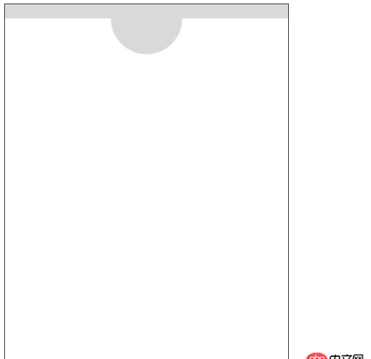
回答1:html:
<p class='boxAll'> <p class='boxA'> </p> <p class='box'></p></p>
css
<style>.boxAll{ width: 400px; height:500px; border: 1px solid #333333; position: relative; background: #D9D9D9;}.boxA{ width: 100%; height:480px; background: #fff; top: 20px; position: absolute;}.box{ width:100px; height:50px; position: absolute; border-radius:0 0 50px 50px; background:#D9D9D9; top: 20px; left: 150px; box-shadow: 0 0 .2rem #e6D6D6;} </style>
效果:
p:before { content: ’’; display: block; position: absolute; top: 0; left: 50%; margin-left: -20px; box-shadow: inset 0px -6px 12px #444; border-radius: 0 0 40px 40px; width: 80px; height: 40px;}
当然这样最上面还会有个黑影,你可以改成两层,内层画一个圆而不是半圆,overflow:hidden,然后相对外层上移半圆的距离就行了
回答3:filter: drop-shadow()或者,必要时用clip-path切割你的容器形状。使用svg也是一个不错的选择。但以上方法都存在兼容性问题。
回答4:大家有实现的可以给个Demo,目前为止,这个效果我还没实现,,这个效果的细节是:直线处的阴影在缺口处能很自然的凹陷下去,,现在的思路是实现一个整体的不规则的容器,然后给这个容器上个阴影,,如果使用一个方形和一个半圆拼凑,我试过,阴影不自然
相关文章:
1. docker网络端口映射,没有方便点的操作方法么?2. 前端 - 类到底该如何去命名 .newsList 这种的命名难道真的不是过度语义化吗?~3. docker api 开发的端口怎么获取?4. Docker for Mac 创建的dnsmasq容器连不上/不工作的问题5. docker images显示的镜像过多,狗眼被亮瞎了,怎么办?6. docker容器呢SSH为什么连不通呢?7. 如何解决Centos下Docker服务启动无响应,且输入docker命令无响应?8. docker start -a dockername 老是卡住,什么情况?9. 请问“由于 Cookie “PHPSESSID”的“SameSite”属性设置为“None”,但缺少“Secure”属性,此 Cookie 未来将被拒绝。”请问出现这个问题怎么办?10. Hbuilder中的phpMyAdmin访问题

 网公网安备
网公网安备