css3 - css做动画效果
问题描述
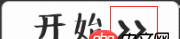
把红色框内做成那种来回动画效果怎么做啊?
问题解答
回答1:<!DOCTYPE html><html><head><style> p{ width:100px; height:100px; background:red; position:relative; animation:mymove 1s infinite; -moz-animation:mymove 1s infinite; /* Firefox */ -webkit-animation:mymove 1s infinite; /* Safari and Chrome */ -o-animation:mymove 1s infinite; /* Opera */ animation-direction: alternate;}@keyframes mymove{ from {left:0px;} to {left:200px;}}@-moz-keyframes mymove /* Firefox */{ from {left:0px;} to {left:200px;}}@-webkit-keyframes mymove /* Safari and Chrome */{ from {left:0px;} to {left:200px;}}@-o-keyframes mymove /* Opera */{ from {left:0px;} to {left:200px;}}</style></head><body><p></p></body></html>
运行一下上面的代码,改于w3school。
链接为:http://www.w3school.com.cn/cs...
回答2:给你个链接 自己对着改参数
回答3:给那个三角图片 摆好位置后, 用类去控制动作。
比如
.move { -webkit-animation-name:’example’; // other code} @-webkit-keyframes ’example’ { 0% {-webkit-transform: translateX(0); } 50% { -webkit-transform: translateX(100px); } 100% { -webkit-transform: translateX(0); } } // 补充说明: -webkit-animation-name:’xxx’;/*动画属性名,也就是我们前面keyframes定义的动画名*/ -webkit-animation-duration: 10s;/*动画持续时间*/ -webkit-animation-timing-function: ease-in-out; /*动画频率,和transition-timing-function是一样的*/ -webkit-animation-delay: 2s;/*动画延迟时间*/ -webkit-animation-iteration-count: 10;/*定义循环资料,infinite为无限次*/ -webkit-animation-direction: alternate;/*定义动画方式* 回答4:
css3的动画效果主要是通过过渡来实现的,用animate来定义一个补间动画,浏览器会自动根据设置的时间来进行渲染。楼上两位大神的代码已经做得很完善了,具体效果题主可以自己根据需要修改
相关文章:
1. javascript - 关于nodejs中的this2. javascript - 关于fullpage.js 自动高度失效的问题3. javascript - 怎样去除数组里的几个值,只提供该数组的下标的话4. javascript - js闭包作用域5. javascript - vuex ...mapActions 报错6. javascript - 求一个浏览器端的能进行图片旋转缩放的js插件7. javascript - 事件的定义有无函数的区别8. css - Flex布局问题9. javascript - 如果根据参数给table中的tr绑定不同事件10. javascript - 为什么newtoy.constructor === Gadget在控制台的结果是false?

 网公网安备
网公网安备